We believe that the whole is greater than the sum of the parts
Our brand is much more than just a symbol: it represents who we are, what we do and how we relate to the market. And to ensure that Intelbras' values are genuinely transmitted, it is important we have integration, consistency and uniformity in our applications.
This guide was developed to be a resource for developing applications, software and interfaces. Here you can find the definition of the required technical standards, such as colors, fonts, icons and dimensions, in order to reinforce the identity of our communication.
It is important that all standards are followed strictly so that this identity is correctly perceived. Necessary adaptations, due to different applications and situations, should be made with discretion.
We understand that it is not possible to contemplate all forms of use in this guide. For this reason, the Industrial Design department of Intelbras is available on grupo.design_industrial@intelbras.com.br for support of applications not foreseen in this guide.

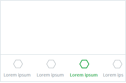
Rule of appliction in the interface

Variations for illustrations or graphics
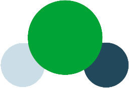
Summary of main colors

The 60/30/10 rule helps to balance the use of colors within the interface. For our interface we opted for a lighter look and therefore the predominance of white, mainly used in the background.
60%
Background
#ffffff
10%
Focal point
#00a335
Hover
#87c984
Pressed
#00863F
30%
Texts
#8b979f
Titles
#3e5055
 Graphics
Our color palette has bright colors that talk to the green Intelbras, its dark and light variations help in the creation of graphics and graphics.
 Main colors
Our color palette has bright colors that talk to the green Intelbras, its dark and light variations help in the creation of graphics and graphics.
Most used colors in the interface.
Used to complement the main colors, for example: in buttons and differentiations in the background.
Used for points of attention such as: notifications, errors, information and failures.
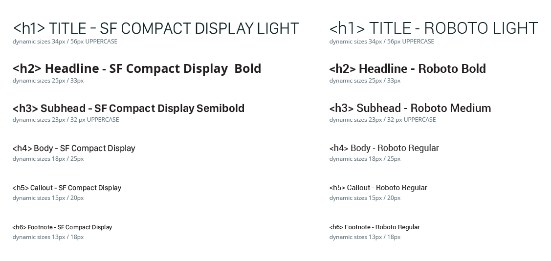
We work with native iOS and Android fonts

iOS

Android

Web Family

We work with native iOS and Android fonts.
<font-family: font-family: "SF Pro", "Roboto", "Arial", "Helvetica", sans-serif;>
Sf Compact Display / Roboto Semibold 16px
Sf Compact Display / Roboto Semibold 14px
Sf Compact Display / Roboto Semibold 13px
Unit to strengthen our brand in mobile apps
Access icons are among the first touch points that our user has in our store within Google Play and the Apple Store and it is important that they are consistent with each other. Therefore we indicate the use of shades of green along with the Intelbras logo for its construction.


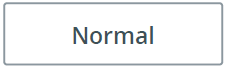
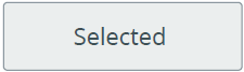
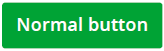
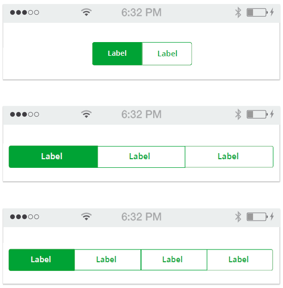
Buttons, forms, modals and other standard elements to support development
ComponentsButtons, fields, and other components to support development
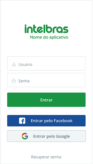
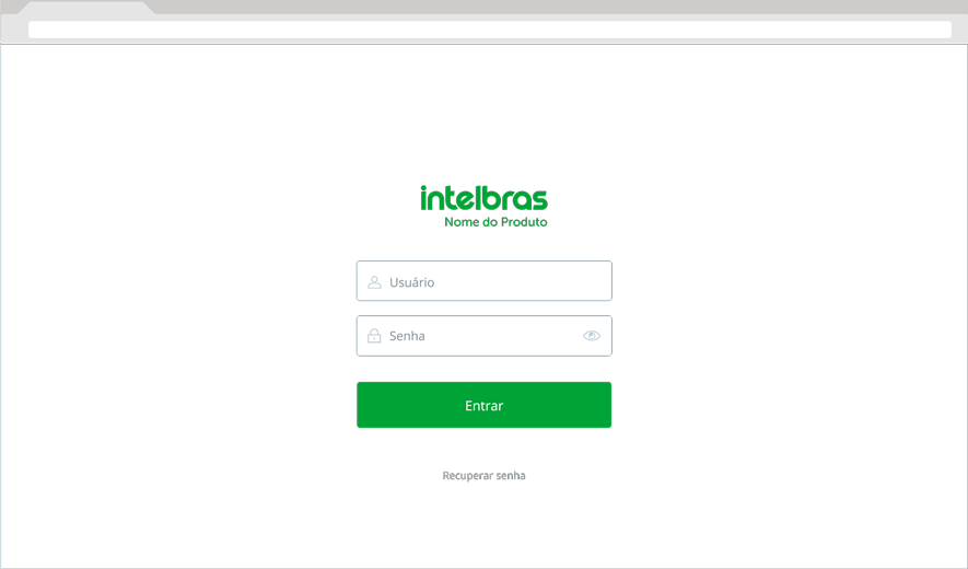
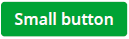
Here is an example of a few differente optional login methods. The logotype should be on tope of the fields. Login button's background color should be #00a335 with white colored (#ffffff) font. Icon and line's colors should be colored #bbcad2 and text should be colored #8b979f.
Mobile
Desktop
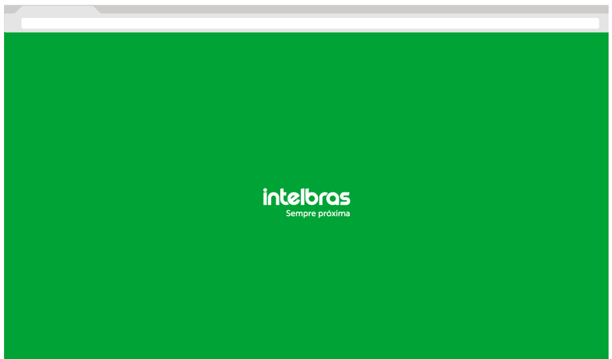
Fore the splash screen, the backgournd color should be #00a335. The logo should be placed centered horizontaly and verticaly.
Mobile

Desktop
 Grid
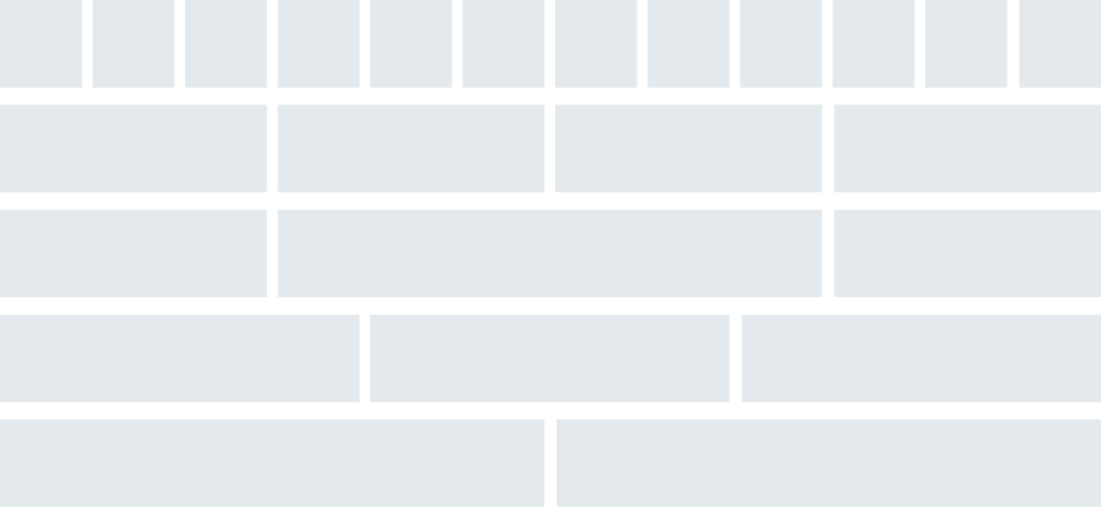
GridThe grid is meant to guide and help organizing the elements within the interface. It must be responsive and fluid. The gutter can range from 16px to 20px depending on the screen size and the number of columns can range from 12 to 2 as needed. For web, grid templates like Bootstrap or pure CSS grids can be used.
 * Code is for reference only, the elements must look exactly like the image provided on this guide*

.container {
  width: 100%;}

.row {
  width: 100%;
  display: flex;
  flex-wrap: wrap;
  margin-top: 5px;}

.row div {
  background-color: #EF5350;
  padding: 3%;
  border: 1px solid white;
  border-radius: 5px;
  text-align: right;
  color: white;
  transition: background-color 1s;}

/* 1/12 */
.col-1 {
  width: 8.33%;}

/* 2/12 */
.col-2 {
  width: 16.66%;}

/* 3/12 */
.col-3 {
  width: 25%;}

/* 4/12 */
.col-4 {
  width: 33.33%}

/* 5/12 */
.col-5 {
  width: 41.66%;}

/* 6/12 */
.col-6 {
  width: 50%;}

/* 7/12 */
.col-7 {
  width: 58.33%;}

/* 8/12 */
.col-8 {
  width: 66.66%;}

/* 9/12 */
.col-9 {
  width: 75%;}

/* 10/12 */
.col-10 {
  width: 83.33%;}

/* 11/12 */
.col-11 {
  width: 91.66%;}

/* 12/12 */
.col-12 {
  width: 100%;}

/* viewport <= 1000px */
@media screen and (max-width: 1000px) {
  * {
    font-size: 1em;  }
}

/* viewport <= 630px */
@media screen and (max-width: 630px) {
  .row div {
    padding: 1.5%;    }
}

/* viewport <= 500px */
@media screen and (max-width: 500px) {
  * {
    font-size: 0.9em;  }
}

<div class="container">

  <div class="row">
    <div class="col-1">1/12</div>
    <div class="col-1">1/12</div>
    <div class="col-1">1/12</div>
    <div class="col-1">1/12</div>
    <div class="col-1">1/12</div>
    <div class="col-1">1/12</div>
    <div class="col-1">1/12</div>
    <div class="col-1">1/12</div>
    <div class="col-1">1/12</div>
    <div class="col-1">1/12</div>
    <div class="col-1">1/12</div>
    <div class="col-1">1/12</div>
  </div>

  <div class="row">
    <div class="col-2">2/12</div>
    <div class="col-2">2/12</div>
    <div class="col-2">2/12</div>
    <div class="col-2">2/12</div>
    <div class="col-2">2/12</div>
    <div class="col-2">2/12</div>
  </div>

  <div class="row">
    <div class="col-3">3/12</div>
    <div class="col-3">3/12</div>
    <div class="col-3">3/12</div>
    <div class="col-3">3/12</div>
  </div>

  <div class="row">
    <div class="col-4">4/12</div>
    <div class="col-4">4/12</div>
    <div class="col-4">4/12</div>
  </div>

  <div class="row">
    <div class="col-6">6/12</div>
    <div class="col-6">6/12</div>
  </div>

  <div class="row">
    <div class="col-5">5/12</div>
    <div class="col-7">7/12</div>
  </div>

  <div class="row">
    <div class="col-4">4/12</div>
    <div class="col-8">8/12</div>
  </div>

  <div class="row">
    <div class="col-3">3/12</div>
    <div class="col-9">9/12</div>
  </div>

  <div class="row">
    <div class="col-2">2/12</div>
    <div class="col-10">10/12</div>
  </div>

  <div class="row">
    <div class="col-1">1/12</div>
    <div class="col-11">11/12</div>
  </div>

  <div class="row">
    <div class="col-12">12/12</div>
  </div>
</div>

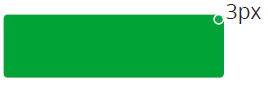
The sizes of the buttons should fallow the grid and proportions indicated. An average adult finger is about 10 mm wide and a mobile button must be at least 40px x 40px


Small
Medium
Large

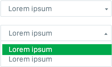
 Forms
FormsInstructions for form fields, inputs and labes.
Nor filled/empty

Filled/text typed

 * Code is for reference only, the elements must look exactly like the image provided on this guide

::placeholder {
	color:#8B979F;
	font-size:13px;
	font-weight: normal;
	}

input[type="text"] {
	padding: 5px 20px;
    border: #8B979F solid 1px;
    color: #3E5055;
    font-size: 15px;
    line-height: 40px;
    max-width: 100%;
    background: #fff;
    -webkit-transition: all 0.3s ease-in-out;
    transition: all 0.3s ease-in-out;
    border-radius: 3px;
	font-weight: 600;
}

input[type="text"]:focus {
    border: none;
    color: #8B979F;
	font-size: 15px;
    background: #f2f4f4;
    -webkit-transition: all 0.3s ease-in-out;
    transition: all 0.3s ease-in-out;
	font-weight: 600;
	outline: none;
}

<input class="intelbras-input" type="text" placeholder="Nome">
 * Code is for reference only, the elements must look exactly like the image provided on this guide*

.intelbras-dropdown-btn {
	font-family: "SF Pro", "Roboto", "Arial", "Helvetica", sans-serif;
    background-color: #fff;
    padding: 12px 40px 12px 20px;
    font-size: 15px;
    border: #8B979F solid 1px;
    cursor: pointer;
	color:#8B979F;
	width: 252px;
	text-align: left;
    outline: none;}

.intelbras-dropdown {
	font-family: "SF Pro", "Roboto", "Arial", "Helvetica", sans-serif;
    position: relative;
    display: inline-block;
}

.intelbras-dropdown-content {
    display: none;
    position: absolute;
    background-color: #fff;
    z-index: 1;
	border: #8B979F solid 1px;
	width: 250px;}

.intelbras-dropdown-content a {
    color: black;
    padding: 12px 16px;
    text-decoration: none;
    display: block;
	color:#8B979F;
	background-color:#fff;
	font-size: 15px;}


.intelbras-dropdown-content a:hover {
	background-color: #00A335;
	color:#fff;}

.intelbras-dropdown:hover .intelbras-dropdown-content {
    display: block;
	top: 42px;}

.arrow {
	width: 0;
	height: 0;
	border-style: solid;
	border-width: 6px 4px 0 4px;
	border-color: #8B979F transparent transparent transparent;
	position: absolute;
	right: 10px;
	top: 20px;}

<div class="intelbras-dropdown">
  <button class="intelbras-dropdown-btn">Select option <span class="arrow"></button>
  <div class="intelbras-dropdown-content">
    <a href="#">Option 1</a>
    <a href="#">Option 2</a>
    <a href="#">Option 3</a>
  </div>
</div>
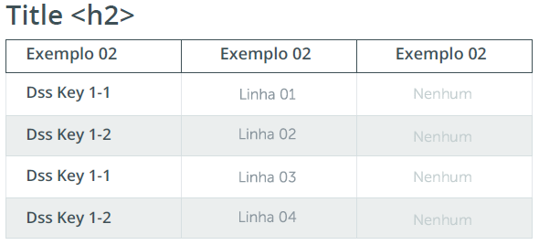
Example 1: Regular table
Example 2: Tables with drop down select
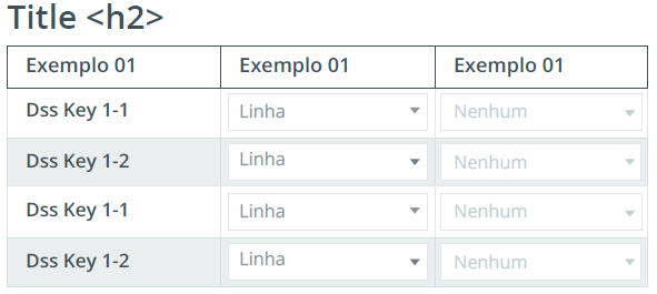
Table cells

*Code is for reference only, the elements must look exactly like the image provided on this guide*

table.intelbras-table {
	font-family: "SF Pro", "Roboto", "Arial", "Helvetica", sans-serif;
	background-color: #FFFFFF;
	width: 450px;
	text-align: center;
	border-collapse: collapse;}

table.intelbras-table td, table.intelbras-table th {
	border: 1px solid #D6DFE1;
	padding: 5px 10px;}

table.intelbras-table tbody td {
	font-size: 15px;
	color: #8B979F;}

table.intelbras-table tr:nth-child(even) {
	background: #EBEEEE;}

table.intelbras-table thead {
	background: #FFFFFF;}

table.intelbras-table thead th {
	font-size: 15px;
	font-weight: bold;
	color: #3E5055;
	border: 1px solid #3E5055;
	text-align: center;}

table.intelbras-table .disabled {
	color: #BBCAD2;}

table.intelbras-table .title {
	color: #3E5055;
	font-weight: 500;
	text-align: left;}
/*table.intelbras-table select {
	width: 100%;
	border: 1px solid #E3E7EA;
	font-family: "SF Pro", "Roboto", "Arial", "Helvetica", sans-serif;
	font-size: 15px;
	color: #8b979f;}*/

.intelbras-table .intelbras-dropdown {
	font-family: "SF Pro", "Roboto", "Arial", "Helvetica", sans-serif;
    position: relative;
    display: inline-block;
	text-align: left;}

.intelbras-table button.intelbras-dropdown-btn{
    font-family: "SF Pro", "Roboto", "Arial", "Helvetica", sans-serif;
    background-color: #fff;
    padding: 5px 10px 5px 10px;
    font-size: 15px;
    border: #8B979F solid 1px;
    cursor: pointer;
    color: #8B979F;
    width: 120px;
    text-align: left;
    outline: none}

.intelbras-table .arrow {
	top: 12px;}

.intelbras-table .intelbras-dropdown-content {
	display: none;
    position: absolute;
    background-color: #fff;
    z-index: 1;
    border: #8B979F solid 1px;
    width: 118px;}

.intelbras-table .intelbras-dropdown-content a{
	padding: 8px 16px;
    text-decoration: none;
    display: block;
    color: #8B979F;
    background-color: #fff;
    font-size: 15px; }

.intelbras-table .intelbras-dropdown:hover .intelbras-dropdown-content {
	display: block;
    top: 29px; }


.intelbras-table .intelbras-dropdown-content a:hover {
    background-color: #00A335;
    color: #fff;}


<table class="intelbras-table">
  <thead>
    <tr>
      <th>Exemplo</th>
      <th>Exemplo</th>
      <th>Exemplo</th>
    </tr>
  </thead>
  <tbody>
    <tr>
      <td><span class="title">Dss Key 1-1</span></td>
      <td><div class="intelbras-dropdown">
          <button class="intelbras-dropdown-btn">Linha 01<span class="arrow"></span></button>
          <div class="intelbras-dropdown-content"> <a href="#">Linha 02</a> <a href="#">Linha 03</a> <a href="#">Linha 04</a> </div>
        </div></td>
      <td><div class="intelbras-dropdown">
          <button class="intelbras-dropdown-btn">Linha 01<span class="arrow"></span></button>
          <div class="intelbras-dropdown-content"> <a href="#">Linha 02</a> <a href="#">Linha 03</a> <a href="#">Linha 04</a> </div>
        </div></td>
    </tr>
    <tr>
      <td><span class="title">Dss Key 1-2</span></td>
      <td><div class="intelbras-dropdown">
          <button class="intelbras-dropdown-btn">Linha 01<span class="arrow"></span></button>
          <div class="intelbras-dropdown-content"> <a href="#">Linha 02</a> <a href="#">Linha 03</a> <a href="#">Linha 04</a> </div>
        </div></td>
      <td><div class="intelbras-dropdown">
          <button class="intelbras-dropdown-btn">Linha 01<span class="arrow"></span></button>
          <div class="intelbras-dropdown-content"> <a href="#">Linha 02</a> <a href="#">Linha 03</a> <a href="#">Linha 04</a> </div>
        </div></td>
    </tr>
    <tr>
      <td><span class="title">Dss Key 1-1</span></td>
      <td><div class="intelbras-dropdown">
          <button class="intelbras-dropdown-btn">Linha 01<span class="arrow"></span></button>
          <div class="intelbras-dropdown-content"> <a href="#">Linha 02</a> <a href="#">Linha 03</a> <a href="#">Linha 04</a> </div>
        </div></td>
      <td><div class="intelbras-dropdown">
          <button class="intelbras-dropdown-btn">Linha 01<span class="arrow"></span></button>
          <div class="intelbras-dropdown-content"> <a href="#">Linha 02</a> <a href="#">Linha 03</a> <a href="#">Linha 04</a> </div>
        </div></td>
    </tr>
    <tr>
      <td><span class="title">Dss Key 1-2</span></td>
      <td><div class="intelbras-dropdown">
          <button class="intelbras-dropdown-btn">Linha 01<span class="arrow"></span></button>
          <div class="intelbras-dropdown-content"> <a href="#">Linha 02</a> <a href="#">Linha 03</a> <a href="#">Linha 04</a> </div>
        </div></td>
      <td><div class="intelbras-dropdown">
          <button class="intelbras-dropdown-btn">Linha 01<span class="arrow"></span></button>
          <div class="intelbras-dropdown-content"> <a href="#">Linha 02</a> <a href="#">Linha 03</a> <a href="#">Linha 04</a> </div>
        </div></td>
    </tr>
  </tbody>
  </tr>

</table>
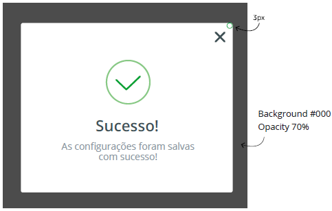
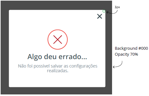
 Modal
ModalUse the modals for feedbacks that require a user action or for feedback of the actions performed by the user. It is a great resource for a closer dialogue.
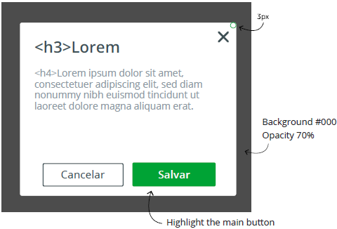
Lorem ipsum dolor sit amet, consectetuer adipiscing elit, sed diam nonummy nibh euismod tincidunt ut laoreet dolore magna aliquam erat.
Cancelar Salvar * Code is for reference only, the elements must look exactly like the image provided on this guide*
.intelbras-modal-overlay {
position: fixed;
z-index: 9999;
top: -5000px;
right: -5000px;
bottom: -5000px;
left: -5000px;
display: none;
background: rgba(43, 46, 56, 0.9);}
.intelbras-modal-wrapper {
position: fixed;
z-index: 10000;
top: 0;
right: 0;
bottom: 0;
left: 0;
display: none;
padding: 10px 10px 0;
overflow: auto;
text-align: center;
-webkit-overflow-scrolling: touch;}
.intelbras-modal {
box-sizing: border-box;
width: 100%;
margin-bottom: 10px;
padding: 35px;
transform: translate3d(0, 0, 0);
color: #2b2e38;
background: #fff;
text-align: left;
border-radius: 3px;
}
.intelbras-modal-confirm {
color: #fff;
background: #00a335;
border: #00a335 2px solid;}
.intelbras-modal-confirm:hover,
.intelbras-modal-confirm:focus {
background: #00863F;
color: #fff;
border: #00863F 2px solid;}
.intelbras-modal-cancel {
color: #3e5055;
background: #fff;
border: #8b979f 2px solid;}
.intelbras-modal-cancel:hover,
.intelbras-modal-cancel:focus {
background: #Ebeeee;
border: #8b979f 2px solid;
color: #3e5055;}
.intelbras-modal-close {
position: absolute;
top: 0;
right: 0;
display: block;
overflow: visible;
width: 35px;
height: 35px;
margin: 0;
padding: 0;
cursor: pointer;
transition: color 0.2s;
text-decoration: none;
color: #95979c;
border: 0;
outline: 0;
background: transparent;}
<div class="intelbras-modal" data-modal-id="modal">
<a data-modal-action="close" class="intelbras-modal-close"></a>
<h3>Lorem Ipsun</h3>
<h4>Lorem ipsum dolor sit amet, consectetuer adipiscing elit, sed diam nonummy nibh euismod tincidunt ut laoreet dolore magna aliquam erat. </h4>
<a data-modal-action="cancel" class="modal-cancel" href="#">Cancelar </a>
<a data-modal-action="confirm" class="modal-confirm" href="#">Salvar </a>
</div>
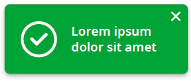
 Notifications
Notifications can report system errors without preventing the user from continuing browsing. They should be in the upper right corner and have the close button. You can also notify fill-in errors. The font is Open Sans/Roboto Semibold. The script used can be of your choosing.
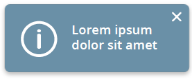
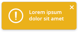
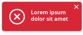
 * Code is for reference only, the elements must look exactly like the image provided on this guide*

.intelbras-notification {
    top: 30px;
	left: 30px;
	max-width: 300px;
	border-radius: 5px;
	position: fixed;
	background: #00a335;
	padding: 22px;
	line-height: 1.4;
	z-index: 1000;
	pointer-events: none;
	color: rgba(250,251,255,0.95);
	font-size: 90%;
	-webkit-box-shadow: 5px 10px 10px 0px rgba(0,0,0,0.12);
    -moz-box-shadow: 5px 10px 10px 0px rgba(0,0,0,0.12);
    box-shadow: 5px 10px 10px 0px rgba(0,0,0,0.12); }

   .intelbras-notification-close {
	width: 20px;
	height: 20px;
	position: absolute;
	right: 4px;
	top: 4px;
	overflow: hidden;
	text-indent: 100%;
	cursor: pointer;
	-webkit-backface-visibility: hidden;
	backface-visibility: hidden;}
How to properly show warnings, requirements and validations. The user must have a good understanding of the meaning states.
 Background #fdebed
 Background #e5f6ed
 * Code is for reference only, the elements must look exactly like the image provided on this guide*
.intelbras-input-wrapper {
height: 50px;
margin: 30px;
}
.intelbras-input{
font-family: "SF Pro", "Roboto", "Arial", "Helvetica", sans-serif;
position:absolute;
}
.intelbras-input input{
padding: 5px 20px;
border: #8B979F solid 1px;
color: #3E5055;
font-size: 15px;
line-height: 40px;
max-width: 100%;
background: #fff;
-webkit-transition: all 0.3s ease-in-out;
transition: all 0.3s ease-in-out;
border-radius: 3px;
padding-top: 10px;
font-weight:bold;
}
.input-invalid1 {
border: #d72736 solid 1px!important;
background-color:#fdebed!important;}
.input-error{
color:#d72736;
font-style: oblique;
font-weight: bold;}
.input-sucess{
border: #00a335 solid 1px!important;
background-color:#e5f6ed!important
}
<div class="intelbras-input-wrapper">
<div class="intelbras-input">
<input class="input-invalid1" type="text">
</div>
</div>
<div class="intelbras-input-wrapper">
<div class="intelbras-input">
<input class="inputText" type="text" required/>
<span class="floating-label">Nome <span class="input-error"> ERRO: Lorem ipsum dolor sit amet.
</div>
</div>
<div class="intelbras-input-wrapper">
<div class="intelbras-input">
<input class="input-sucess" type="text">
</div>
</div>
* Code is for reference only, the elements must look exactly like the image provided on this guide*
.badge {
position:relative;
font-family: "SF Pro", "Roboto", "Arial", "Helvetica", sans-serif; color:#8b97af; text-decoration:none; font-weight:bold;}
.badge[data-badge]:after {
content:attr(data-badge);
position:absolute;
top:-5px;
right:-25px;
font-size:.7em;
background:#ef3d53;
color:#fff;
width:19px;
height:19px;
text-align:center;
line-height:20px;
border-radius:50%;
font-weight:bold; }
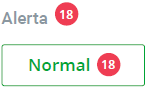
<a href="" class="badge" data-badge="18">Alerta</a>
<button class="intelbras-button2"><a href="" class="badge" data-badge="18"><span style="color:#00a335">Normal</span></a></button>
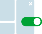
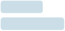
 Form elements
Forms, sliders and other interactive elements.


* Code is for reference only, the elements must look exactly like the image provided on this guide*
/* toggle */
.switch {
position: relative;
display: inline-block;
width: 60px;
height: 34px;}
.switch input {display:none;}
.slider {
position: absolute;
cursor: pointer;
top: 0;
left: 0;
right: 0;
bottom: 0;
background-color: #c3ced0;
-webkit-transition: .4s;
transition: .4s;}
.slider:before {
position: absolute;
content: "";
height: 26px;
width: 26px;
left: 4px;
bottom: 4px;
background-color: white;
-webkit-transition: .4s;
transition: .4s;}
input:checked + .slider {
background-color: #00A335;}
input:focus + .slider {
box-shadow: 0 0 1px #2196F3;}
input:checked + .slider:before {
-webkit-transform: translateX(26px);
-ms-transform: translateX(26px);
transform: translateX(26px);}
.slider.round {
border-radius: 34px;}
.slider.round:before {
border-radius: 50%;}
/* checkbox */
.checkbox input[type="checkbox"] {
display:none;}
.checkbox label {
position: relative;
display: inline-block;
padding-left: 22px;}
.checkbox label::before,
.checkbox label::after {
position: absolute;
content: "";
display: inline-block;}
.checkbox label::before{
height: 16px;
width: 16px;
border: #c0cdd5 1px solid;
left: 0px;
top: 3px;}
.disabled ::before{
background-color: #c0cdd5;}
.checked ::before{
background-color: #00a335;}
.checkbox label::after {
height: 5px;
width: 9px;
border-left: #fff 2px solid;
border-bottom: #fff 2px solid;
left: 4px;
top: 7px;
transform: rotate(-45deg);
}
.checkbox input[type="checkbox"] + label::after {
content: none;}
.checkbox input[type="checkbox"]:checked + label::after {
content: "";}
/* radio */
.radio-button {
position: relative;
margin: 20px 0;}
.radio-button input {
position: absolute;
margin: 5px;
padding: 0;
/* for mobile accessibility (iOS Label Bug) */
visibility: hidden;}
.radio-button .label-visible{
margin-left: 2em;
margin-bottom: 0;}
.fake-radiobutton{
position: absolute;
display: block;
top: 0;
left: 3px;
width: 20px;
height: 20px;
border: 1px solid #c0cdd5;
background-color: white;}
.radio-disabled{
width: 12px;
height: 12px;
border: 5px solid #d1dae0;
background-color: #bbcad2;}
.radio-checked{
position: absolute;
display: block;
top: 0;
left: 3px;
width: 20px;
height: 20px;
border: 1px solid #00a335;
background-color: white;}
.fake-radiobutton:after {
content: "";
display: none;
position: absolute;
top: 50%;
left: 50%;
width: 13px;
height: 13px;
background: #00a335;
transform: translateX(-50%) translateY(-50%);}
.fake-radiobutton { border-radius: 50%; }
.fake-radiobutton:after { border-radius: 50%; }
input[type="radio"]:checked + span .fake-radiobutton:after{ display: block; }
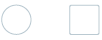
<label class="switch">
<input type="checkbox">
<span class="slider round"></span>
</label>
<br />
<br />
<div class="checkbox">
<input type="checkbox" id="checkbox_1">
<label for="checkbox_1"></label>
</div><br />
<div class="checkbox disabled">
<input type="checkbox" id="checkbox_2" >
<label for="checkbox_2"></label>
</div><br />
<div class="checkbox checked">
<input type="checkbox" id="checkbox_3" checked="checked">
<label for="checkbox_3"></label>
</div>
<br />
<br />
<label class="radio-button">
<input type="radio" name="radio" >
<span class="label-visible">
<span class="fake-radiobutton"></span>
</span>
</label>
<br />
<br />
<label class="radio-button">
<input type="radio" name="radio">
<span class="label-visible">
<span class="fake-radiobutton radio-disabled"></span>
</span>
</label>
<br />
<br />
<label class="radio-button">
<input type="radio" name="radio" checked="checked">
<span class="label-visible">
<span class="fake-radiobutton radio-checked"></span>
</span>
</label>
* Code is for reference only, the elements must look exactly like the image provided on this guide*
input[type='range'] {
width: 210px;
height: 50px;
cursor: pointer;
outline: none;
vertical-align: middle;
margin-bottom: 20px;}
input[type='range'],
input[type='range']::-webkit-slider-runnable-track,
input[type='range']::-webkit-slider-thumb {
-webkit-appearance: none;}
input[type='range']::-webkit-slider-runnable-track {
width: 200px;
height: 4px;
background: linear-gradient(to right, #00a335, #00a335), #d6dfe1;
background-size: 10% 100%;
background-repeat: no-repeat;
}
input[type='range']::-webkit-slider-thumb {
height: 20px;
width: 20px;
margin-top: -8px;
background: #00a335;
border-radius: 50%;}
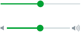
<div class="container">
<img src="images/vol1.png" />
<input type="range" min="0" max="100" value="10" />
<img src="images/vol2.png" />
</div>
 Font: Open Sans Regular, 12px, #FFFFFF
* Code is for reference only, the elements must look exactly like the image provided on this guide*
[data-tooltip] {
position: relative;
z-index: 2;
cursor: pointer;}
[data-tooltip]:before,
[data-tooltip]:after {
visibility: hidden;
-ms-filter: "progid:DXImageTransform.Microsoft.Alpha(Opacity=0)";
filter: progid: DXImageTransform.Microsoft.Alpha(Opacity=0);
opacity: 0;
pointer-events: none;}
[data-tooltip]:before {
position: absolute;
bottom: 150%;
left: 50%;
margin-bottom: 5px;
margin-left: -80px;
padding: 7px;
width: 170px;
-webkit-border-radius: 3px;
-moz-border-radius: 3px;
border-radius: 3px;
background-color: #8b979f;
color: #fff;
content: attr(data-tooltip);
text-align: left;
font-size: 14px;
line-height: 1.3;
font-weight:normal;}
[data-tooltip]:after {
position: absolute;
bottom: 150%;
left: 50%;
margin-left: -5px;
width: 0;
border-top: 5px solid #8b979f;
border-right: 5px solid transparent;
border-left: 5px solid transparent;
content: " ";
font-size: 0;
line-height: 0;}
[data-tooltip]:hover:before,
[data-tooltip]:hover:after {
visibility: visible;
-ms-filter: "progid:DXImageTransform.Microsoft.Alpha(Opacity=100)";
filter: progid: DXImageTransform.Microsoft.Alpha(Opacity=100);
opacity: 1;}
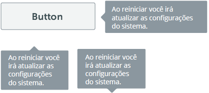
<button class="intelbras-button-secondary" data-tooltip="Ao reiniciar você irá atualizar as configurações do sistema">Button</button>
 Cards
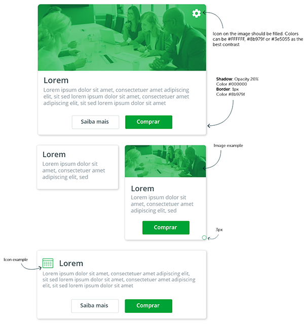
CardsCards should be used mainly in dashboards, to group similar content or to support visual organization. Cards might include a title, a subtitle, a summary text, animage or video, comments and a Call to Action button. Actions are usually limited, and in many cases, the entire card works as a link.
* Code is for reference only, the elements must look exactly like the image provided on this guide*

.card {
	display: inline-block;
	box-shadow: 0 1px 2px 0 rgba(0,0,0,.20);
	margin: 20px;
	position: relative;
	margin-bottom: 50px;
	transition: all .2s ease-in-out;
	border-radius: 3px;
}
.card.large {
	width: 460px;}


.card.small {
	width: 240px;}

.card.medium {
	width: 240px;}

.card.long {
	width: 460px;}


.card:hover {
	box-shadow: 0 10px 20px rgba(0,0,0,0.19), 0 6px 6px rgba(0,0,0,0.23);
	margin-bottom: 54px;}
.card .image {
	height: 200px;
	opacity: .9;
	overflow: hidden;
	transition: all .2s ease-in-out;}
.card .image:hover, .card .card:hover .image {
	height: 200px;
	opacity: 1;}

.card h3 {color:#3E5055;}

.card .text {
	background: #FFF;
	padding: 10px 20px;}

.card .text p {
	margin-bottom: 0px;}

.card .fab {
	position: absolute;
	margin-top: -200px;
	right: 20px;
	text-align: center;
	-webkit-transition: -webkit-transform .2s ease-in-out;
	transition: transform .2s ease-in-out;}

.card .fab:hover {
	cursor: pointer;
	transform: scale(1.1);}

.card-buttons {
	width: 100%;
	text-align: center;
	margin: 20px 0 10px 0;}


<div class="card large">
  <div class="image"> <img src="images/cards.jpg" width="100%"> </div>
  <div class="text">
    <div class="fab"><img src="images/gear.png" width="28" height="28" /></div>
    <h3>Lorem</h3>
    <p>Lorem ipsum dolor sit amet, consectetuer amet adipiscing
      elit, sit sed lorem ipsum dolor sit amet, consectetuer amet
      adipiscing elit, sit sed lorem ipsum dolor sit amet.</p>
    <div class="card-buttons">
    <button class="intelbras-button-secondary" >Saiba mais</button>
      <button class="intelbras-button-primary">Comprar</button>

    </div>
  </div>
</div>

<br />
<br />

<div class="card small">
  <div class="text">
    <h3>Lorem</h3>
    <p>Lorem ipsum dolor sit amet, consectetuer amet adipiscing
      elit, sit sed lorem ipsum dolor sit amet.</p>
  </div>
</div>

<br />
<br />

<div class="card medium">
  <div class="image"> <img src="images/cards.jpg" width="100%"> </div>
  <div class="text">
    <h3>Lorem</h3>
    <p>Lorem ipsum dolor sit amet, consectetuer amet adipiscing
      elit, sit sed lorem ipsum dolor sit amet, consectetuer amet
      adipiscing elit, sit sed lorem ipsum dolor sit amet.</p>
    <div class="card-buttons">
      <button class="intelbras-button-primary">Comprar</button>
    </div>
  </div>
</div>

<br />
<br />

<div class="card long">
  <div class="text">
    <h3><img src="images/calendar.png" width="22" height="19" /> Lorem</h3>
    <p>Lorem ipsum dolor sit amet, consectetuer amet adipiscing
      elit, sit sed lorem ipsum dolor sit amet, consectetuer amet
      adipiscing elit, sit sed lorem ipsum dolor sit amet.</p>
    <div class="card-buttons">
      <button class="intelbras-button-secondary" >Saiba mais</button>
      <button class="intelbras-button-primary">Comprar</button>
    </div>
  </div>
</div>
 Icons
IconsIcons can be used to support a clearer navigation and the understanding of functions and actions.
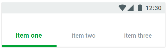
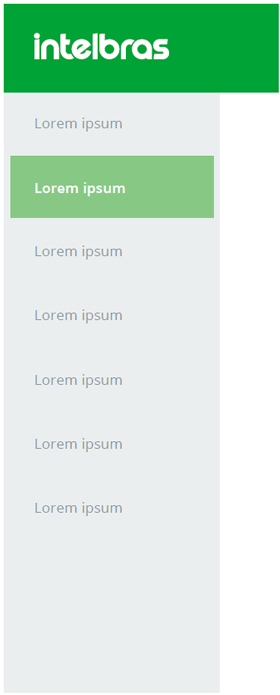
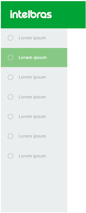
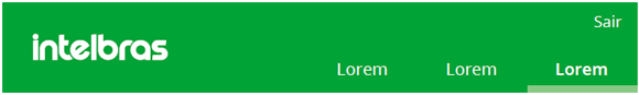
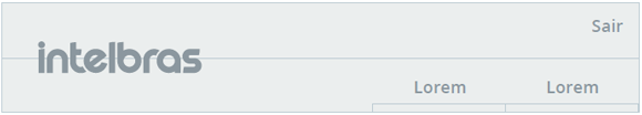
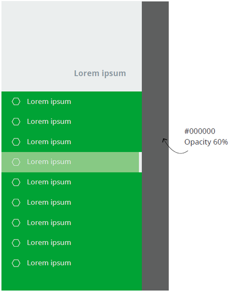
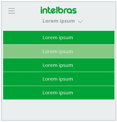
 Navigation menu
Side menus can be used with or without the support of icons
Desktop side menu
Desktop side menu with icons
Desktop top menu
Desktop top menu grid
Mobile side menu
Mobile top menu
Mobile bottom menu